Unity UI Toolkit으로 만드는 반응형 인벤토리와 툴팁 UI
UI Toolkit의 UXML·USS·C# 이벤트 시스템을 이용해 화면 크기에 대응하는 인벤토리 그리드와 재사용 가능한 툴팁을 구현합니다. 레이아웃 설계부터 데이터 바인딩과 입력 처리까지 실전 구조로 정리합니다.
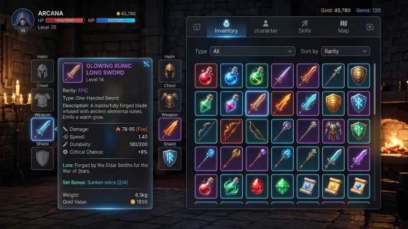
목표와 구성
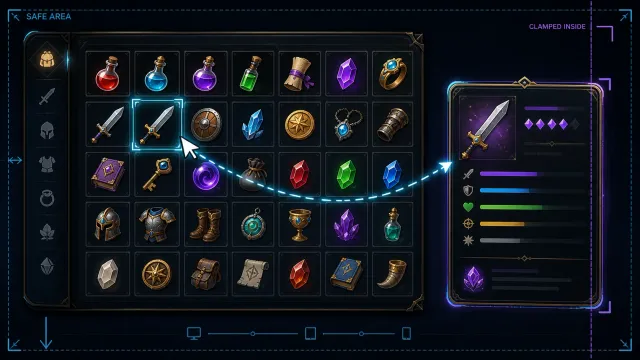
인벤토리 UI는 아이템 수와 화면 크기가 계속 바뀌기 때문에 좌표를 직접 계산하는 방식보다 레이아웃 시스템에 맡기는 편이 유지보수에 유리합니다. Unity UI Toolkit에서는 UXML로 구조를 정의하고 USS로 반응형 레이아웃을 구성하며 C#으로 데이터를 연결할 수 있습니다.
이 글에서는 다음 구조를 만듭니다.
- 가용 폭에 맞춰 열 수가 바뀌는 아이템 그리드
- 슬롯 선택과 마우스 오버 상태 처리
- 커서를 따라가되 화면 밖으로 나가지 않는 툴팁
- 게임 데이터와 화면 표현을 분리하는 바인딩 방식
flowchart TD
    A[InventoryData] --> B[InventoryView]
    B --> C[ItemSlot VisualElement]
    C --> D[Pointer 이벤트]
    D --> E[TooltipController]
    E --> F[Tooltip VisualElement]
데이터는 화면 요소를 직접 알 필요가 없고 화면은 데이터 형식에 맞춰 그려지는 역할만 맡습니다. 이 경계를 지키면 장비 창, 상점, 제작 창에서도 같은 슬롯과 툴팁을 재사용하기 쉬워집니다.
UXML로 기본 구조 만들기
먼저 InventoryView.uxml을 만듭니다. ScrollView 안에 슬롯 컨테이너를 두고 툴팁은 같은 루트에 별도 요소로 배치합니다. 툴팁을 스크롤 영역 밖에 두어야 스크롤 위치의 영향을 받지 않습니다.
<ui:UXML xmlns:ui="UnityEngine.UIElements"
         xmlns:uie="UnityEditor.UIElements">
    <ui:VisualElement name="inventory-root" class="inventory-root">
        <ui:Label text="인벤토리" class="inventory-title" />

        <ui:ScrollView name="inventory-scroll" class="inventory-scroll">
            <ui:VisualElement name="item-grid" class="item-grid" />
        </ui:ScrollView>

        <ui:VisualElement name="item-tooltip" class="item-tooltip">
            <ui:Label name="tooltip-name" class="tooltip-name" />
            <ui:Label name="tooltip-description" class="tooltip-description" />
            <ui:Label name="tooltip-count" class="tooltip-count" />
        </ui:VisualElement>
    </ui:VisualElement>
</ui:UXML>
UIDocument 컴포넌트의 Visual Tree Asset에 이 UXML을 연결합니다. 런타임 UI라면 Panel Settings도 함께 지정해야 합니다.
USS로 반응형 슬롯 그리드 구성하기
이 USS 예제는 Unity 2022.3과 6.0의 문서화된 스타일 속성 및 선택자를 기준으로 작성했습니다. Unity 2022.3 및 6.0의 USS 속성 레퍼런스에는 gap이 없으므로, 슬롯 자식에 margin을 주어 간격을 만듭니다. 이 방식은 마지막 열과 마지막 행에도 바깥 여백을 남긴다는 점을 고려하세요.
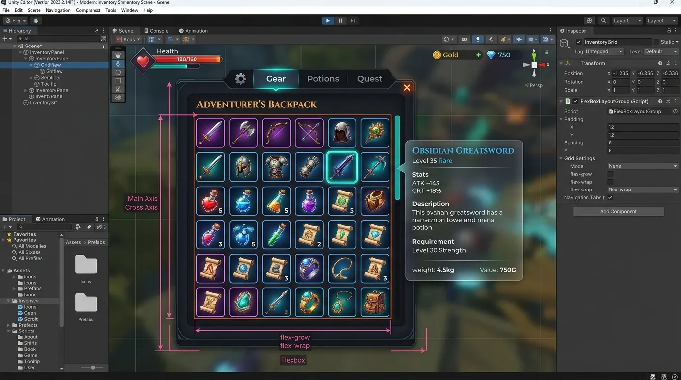
UI Toolkit의 Flexbox 레이아웃은 컨테이너 폭이 달라질 때 특히 유용합니다. 슬롯에 고정 폭을 주고 flex-wrap: wrap을 적용하면 한 줄에 들어가는 슬롯 수가 자연스럽게 바뀝니다.
.inventory-root {
    flex-grow: 1;
    position: relative;
    padding: 20px;
    background-color: rgb(24, 27, 35);
}

.inventory-title {
    margin-bottom: 12px;
    font-size: 22px;
    -unity-font-style: bold;
    color: rgb(240, 240, 245);
}

.inventory-scroll {
    flex-grow: 1;
}

.item-grid {
    flex-direction: row;
    flex-wrap: wrap;
    align-content: flex-start;
}

.item-slot {
    width: 84px;
    height: 84px;
    padding: 6px;
    justify-content: flex-end;
    background-color: rgb(51, 57, 72);
    border-radius: 6px;
    border-width: 1px;
    border-color: rgb(91, 101, 126);
    margin-right: 8px;
    margin-bottom: 8px;
}

.item-slot:hover {
    background-color: rgb(71, 82, 107);
    border-color: rgb(210, 178, 88);
}

.item-slot--selected {
    border-width: 2px;
    border-color: rgb(255, 211, 91);
}

.item-count {
    align-self: flex-end;
    color: white;
    -unity-font-style: bold;
}
슬롯의 폭을 퍼센트로 지정하면 넓은 화면에서 슬롯이 과도하게 커질 수 있습니다. 일반적인 게임 인벤토리는 슬롯 크기를 일정하게 유지하고 줄 수를 조절하는 방식이 조작감과 아이콘 가독성 면에서 안정적입니다.
USS에는 CSS @media 쿼리가 없으므로, 패널 크기를 관찰해 루트 요소에 is-compact 클래스를 붙이고 해당 USS 선택자를 적용합니다. 아래의 C# 예제는 레이아웃 변경 시 전송되는 GeometryChangedEvent에서 클래스를 갱신하며, 첫 레이아웃 값도 확인합니다.
.inventory-root.is-compact {
    padding: 10px;
}

.inventory-root.is-compact .item-slot {
    width: 68px;
    height: 68px;
    margin-right: 5px;
    margin-bottom: 5px;
}
간격은 각 슬롯의 오른쪽·아래쪽 margin이므로 마지막 열과 행에도 같은 바깥 여백이 붙습니다. 콘텐츠 경계에 딱 맞춰야 한다면 그 여백만큼 컨테이너 패딩이나 스크롤 영역 크기를 조정하세요.
아이템 데이터와 슬롯 생성 코드
아이템 데이터를 표현하는 간단한 모델을 정의합니다. 실제 프로젝트에서는 ScriptableObject, 저장 데이터, 서버 응답 등으로부터 이 값을 구성할 수 있습니다.
using System;
using UnityEngine;

[Serializable]
public class InventoryItem
{
    public string Id;
    public string DisplayName;
    [TextArea] public string Description;
    public Sprite Icon;
    public int Count;
}
다음은 UXML을 찾고 슬롯을 생성하는 InventoryView 예제입니다. 슬롯을 만들 때 데이터 참조를 userData에 저장하면 이벤트 처리에서 별도의 검색 없이 원본 아이템을 확인할 수 있습니다.
using System.Collections.Generic;
using UnityEngine;
using UnityEngine.UIElements;

[RequireComponent(typeof(UIDocument))]
public class InventoryView : MonoBehaviour
{
    [SerializeField] private List<InventoryItem> items = new();

    private VisualElement grid;
    private VisualElement inventoryRoot;
    private VisualElement selectedSlot;
    private TooltipController tooltip;
    private const float CompactBreakpoint = 600f;

    private void OnEnable()
    {
        VisualElement root = GetComponent<UIDocument>().rootVisualElement;
        inventoryRoot = root.Q<VisualElement>("inventory-root");
        grid = root.Q<VisualElement>("item-grid");
        inventoryRoot.RegisterCallback<GeometryChangedEvent>(OnInventoryRootGeometryChanged);
        UpdateResponsiveClass(inventoryRoot.layout.width);
        tooltip = new TooltipController(root);

        RenderItems();
    }

    private void OnDisable()
    {
        if (inventoryRoot != null)
        {
            inventoryRoot.UnregisterCallback<GeometryChangedEvent>(OnInventoryRootGeometryChanged);
            inventoryRoot = null;
        }
        tooltip?.Dispose();
        tooltip = null;
    }

    private void OnInventoryRootGeometryChanged(GeometryChangedEvent evt)
    {
        UpdateResponsiveClass(evt.newRect.width);
    }

    private void UpdateResponsiveClass(float width)
    {
        inventoryRoot.EnableInClassList("is-compact", width < CompactBreakpoint);
    }

    private void RenderItems()
    {
        grid.Clear();

        foreach (InventoryItem item in items)
        {
            VisualElement slot = CreateSlot(item);
            grid.Add(slot);
        }
    }

    private VisualElement CreateSlot(InventoryItem item)
    {
        var slot = new VisualElement { userData = item };
        slot.AddToClassList("item-slot");

        if (item.Icon != null)
        {
            slot.style.backgroundImage = new StyleBackground(item.Icon);
            slot.style.backgroundSize = new BackgroundSize(BackgroundSizeType.Contain);
            slot.style.backgroundRepeat = new BackgroundRepeat(Repeat.NoRepeat, Repeat.NoRepeat);
            slot.style.unityBackgroundImageTintColor = Color.white;
        }

        var count = new Label(item.Count > 1 ? item.Count.ToString() : string.Empty);
        count.AddToClassList("item-count");
        slot.Add(count);

        slot.RegisterCallback<PointerEnterEvent>(evt =>
        {
            tooltip.Move(slot.LocalToWorld(evt.localPosition));
            tooltip.Show(item);
        });
        slot.RegisterCallback<PointerMoveEvent>(evt =>
        {
            // localPosition is relative to this registered target; convert it to panel coordinates.
            Vector2 panelPosition = slot.LocalToWorld(evt.localPosition);
            tooltip.Move(panelPosition);
        });
        slot.RegisterCallback<PointerLeaveEvent>(_ => tooltip.Hide());
        slot.RegisterCallback<ClickEvent>(_ => SelectSlot(slot));

        return slot;
    }

    private void SelectSlot(VisualElement slot)
    {
        selectedSlot?.RemoveFromClassList("item-slot--selected");
        selectedSlot = slot;
        selectedSlot.AddToClassList("item-slot--selected");
    }
}RenderItems()는 전체 목록을 다시 그리는 간단한 구현입니다. 슬롯 수가 매우 많거나 변경이 자주 일어나는 UI는 ListView의 가상화를 검토하는 편이 좋습니다. 반면 수십 칸 규모의 일반 인벤토리에서는 명확한 생성 코드가 더 다루기 쉬운 경우가 많습니다.
커서와 화면 경계를 고려한 툴팁
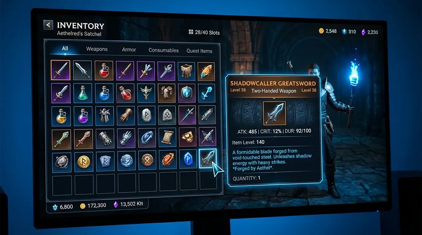
툴팁은 마우스 위치에 그대로 배치하면 패널의 오른쪽이나 아래쪽에서 잘릴 수 있습니다. 따라서 툴팁 크기와 패널 크기를 비교한 뒤 표시 위치를 보정해야 합니다.
.item-tooltip {
    display: none;
    position: absolute;
    width: 260px;
    padding: 12px;
    background-color: rgb(18, 20, 27);
    border-width: 1px;
    border-color: rgb(139, 119, 69);
    border-radius: 6px;
    color: rgb(235, 235, 240);
}

.tooltip-name {
    margin-bottom: 6px;
    font-size: 16px;
    -unity-font-style: bold;
    color: rgb(255, 214, 103);
}

.tooltip-description {
    white-space: normal;
    color: rgb(210, 214, 225);
}

.tooltip-count {
    margin-top: 8px;
    color: rgb(160, 190, 255);
}
아래 컨트롤러는 패널 좌표계의 포인터 위치를 받아 툴팁을 이동합니다. GeometryChangedEvent 이후에 실제 레이아웃 크기를 사용할 수 있으므로 표시 직후와 이동할 때 모두 위치를 계산합니다.
using UnityEngine;
using UnityEngine.UIElements;

public class TooltipController
{
    private const float CursorOffset = 16f;
    private const float ScreenMargin = 8f;

    private readonly VisualElement root;
    private readonly VisualElement tooltip;
    private readonly Label nameLabel;
    private readonly Label descriptionLabel;
    private readonly Label countLabel;

    private Vector2 lastPointerPosition;

    public TooltipController(VisualElement root)
    {
        this.root = root;
        tooltip = root.Q<VisualElement>("item-tooltip");
        nameLabel = root.Q<Label>("tooltip-name");
        descriptionLabel = root.Q<Label>("tooltip-description");
        countLabel = root.Q<Label>("tooltip-count");

        tooltip.pickingMode = PickingMode.Ignore;
        nameLabel.pickingMode = PickingMode.Ignore;
        descriptionLabel.pickingMode = PickingMode.Ignore;
        countLabel.pickingMode = PickingMode.Ignore;
        tooltip.RegisterCallback<GeometryChangedEvent>(HandleGeometryChanged);
        root.RegisterCallback<GeometryChangedEvent>(HandleGeometryChanged);
    }

    private void HandleGeometryChanged(GeometryChangedEvent evt) => UpdatePosition();

    public void Dispose()
    {
        tooltip.UnregisterCallback<GeometryChangedEvent>(HandleGeometryChanged);
        root.UnregisterCallback<GeometryChangedEvent>(HandleGeometryChanged);
        Hide();
    }

    public void Show(InventoryItem item)
    {
        nameLabel.text = item.DisplayName;
        descriptionLabel.text = item.Description;
        countLabel.text = $"보유 수량: {item.Count}";
        tooltip.style.display = DisplayStyle.Flex;
        UpdatePosition();
    }

    public void Move(Vector2 pointerPosition)
    {
        lastPointerPosition = root.WorldToLocal(pointerPosition);
        UpdatePosition();
    }

    public void Hide()
    {
        tooltip.style.display = DisplayStyle.None;
    }

    private void UpdatePosition()
    {
        if (tooltip.resolvedStyle.display == DisplayStyle.None)
        {
            return;
        }

        float x = lastPointerPosition.x + CursorOffset;
        float y = lastPointerPosition.y + CursorOffset;

        Rect bounds = root.contentRect;
        float minX = bounds.xMin + ScreenMargin;
        float minY = bounds.yMin + ScreenMargin;
        float maxX = Mathf.Max(minX, bounds.xMax - tooltip.resolvedStyle.width - ScreenMargin);
        float maxY = Mathf.Max(minY, bounds.yMax - tooltip.resolvedStyle.height - ScreenMargin);

        tooltip.style.left = Mathf.Clamp(x, minX, maxX);
        tooltip.style.top = Mathf.Clamp(y, minY, maxY);
    }
}PointerLeaveEvent가 발생하는 이유는 슬롯에서 마우스가 벗어났기 때문입니다. 툴팁과 자식 Label의 pickingMode를 C#에서 PickingMode.Ignore로 설정하면 포인터를 가로채는 일을 막을 수 있습니다. USS에는 picking-mode 속성이 없습니다. 위치 보정은 루트 내부 좌표와 contentRect를 사용하며, 컨트롤러를 폐기할 때 레이아웃 이벤트도 해제합니다. 툴팁이 루트보다 크면 위치 보정만으로 잘림을 없앨 수 없으므로 최대 크기나 스크롤 정책도 필요합니다.
입력 방식별 고려 사항
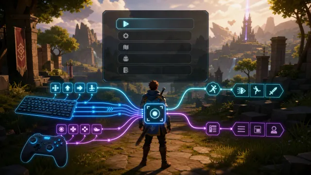
마우스 환경에서는 호버 툴팁이 자연스럽지만 터치 환경에는 호버가 없습니다. 따라서 입력 장치에 따라 상호작용을 나누는 편이 좋습니다.
- 마우스: 포인터 진입 시 툴팁을 열고 이동에 맞춰 위치를 갱신합니다.
- 터치: 첫 탭으로 선택하거나 상세 패널을 열고 두 번째 탭으로 사용 또는 장착합니다.
- 게임패드: 포커스된 슬롯을 기준으로 툴팁을 표시하고 방향 입력으로 슬롯을 이동합니다.
UI Toolkit의 포커스 처리와 NavigationMoveEvent를 이용하면 게임패드 내비게이션을 구성할 수 있습니다. 다만 인벤토리에서는 자동 내비게이션만으로 원하는 이동 순서가 나오지 않을 수 있으므로 슬롯 배치가 복잡하다면 명시적인 포커스 이동 규칙도 검토해야 합니다.
유지보수를 위한 점검 항목
구현을 마친 뒤에는 화면을 넓히고 좁히는 것만으로 끝내지 말고 다음 항목을 확인합니다.
- 해상도가 달라도 슬롯이 겹치거나 툴팁이 잘리지 않는지 확인합니다.
- 긴 아이템 이름과 여러 줄 설명에서 툴팁의 크기가 자연스럽게 늘어나는지 확인합니다.
- 아이템이 없을 때 빈 상태 안내가 필요한지 확인합니다.
- 아이템 수량 변경 시 숫자만 갱신할지 목록 전체를 다시 그릴지 기준을 정합니다.
- 마우스, 터치, 게임패드에서 같은 기능이 이해 가능한 방식으로 제공되는지 확인합니다.
핵심은 슬롯의 배치를 코드로 계산하지 않고 USS 레이아웃에 맡기는 것입니다. 여기에 데이터 모델과 UI 요소를 분리하고 툴팁 위치를 패널 경계 안에서 보정하면 해상도 변화와 기능 확장에 비교적 강한 인벤토리 UI를 만들 수 있습니다.